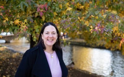
I am SO excited to share my new branding! I say ‘new’, but I’ve never actually had it done. I’ve had a few logos over the years, done by friends, but my latest logo I did myself in Canva when I finally gave up the day job (early 2020). Now I feel like my business is in a real groove and I’ve realised what’s important to me and what I’m really passionate about.
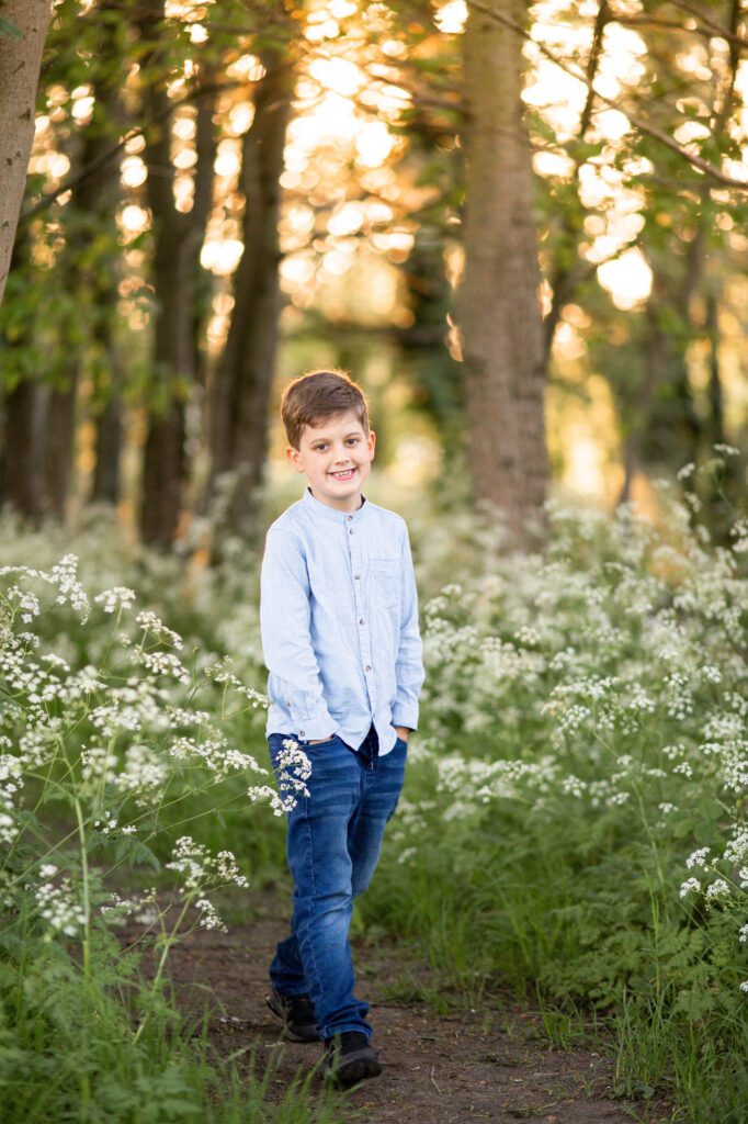
I’ve learnt over the last few years that branding is lot more than just a logo, it’s should represent your personality, identity and values. The same goes for having a branding photo shoot – it’s so much more than ‘just’ a headshot. It helps build trust, makes you memorable, elevates your business and should make you stand out from your competitors.
Through a local networking group I’m part of, Buzz Hub Co, I met Sam from Gab Marketing and it planted the seed to start thinking about a change as I wasn’t feeling like my logo was a true reflection of my work and personality. To be honest, I felt pretty embarrassed about it, as it didn’t feel very professional at all. I talk a lot about small businesses showing their brand through their headshots and photos and it felt like I should practice what I preach a bit more when it came to my own branding. I love supporting local, and Sam lives in my village so I couldn’t get much more local! I’d taken some headshots for Sam at an event and we started building a bit of a relationship through Instagram and in May, I finally took the plunge to use her services.
We had a meeting so she could better understand my business and needs, for now and the future. Her communication was great throughout and we made a few tweaks before the final design was agreed. I am thrilled with it and I finally feel proud of it as it’s a true reflection of me and my business.
So here’s the big reveal and a bit more behind the meaning…

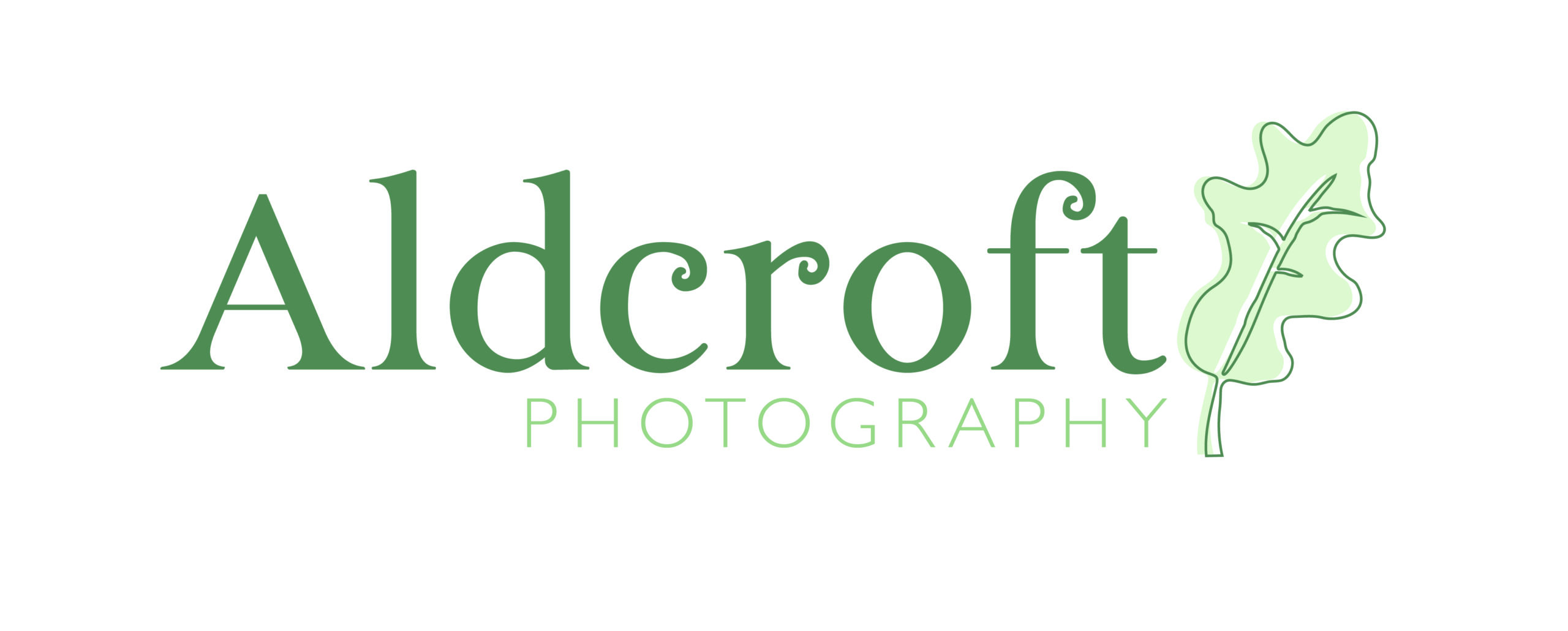
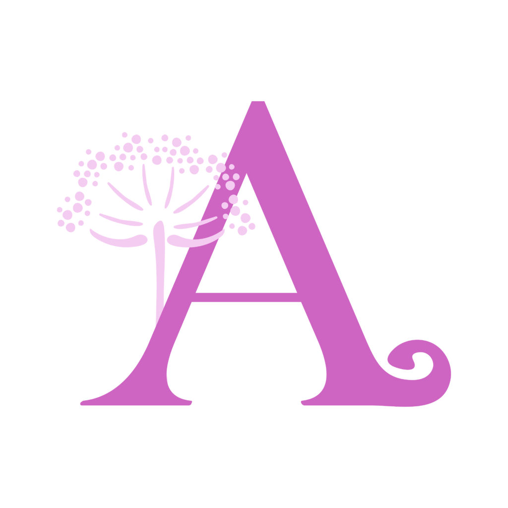
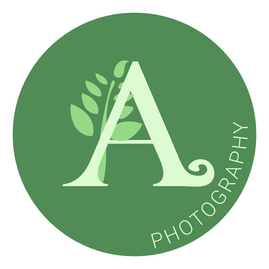
My love of nature and photographing families outdoors meant a strong draw to the colour green and I had to include some outdoorsy motifs, which Sam hand designed specifically for me. Oak became the key motif, which we chose for my primary logo. I also love pink and felt that complimented the green as well as giving a femininity as I’m a huge advocate of Mum’s and businesswomen getting in the frame. I also felt that pink would fit well with my wedding photography and my newborn home sessions. My secondary logos can be used for different parts of my business and literature so the diversity of it all really lends itself to the variety of work I do.
Oak trees are my favourite tree, they are all so different and unique, and I feel that is just like my clients. The oak is a symbol of growth, which is also just like my clients – growth of the family and growth of a business. The oak tree is a symbol of strength, and stability, longevity and wisdom which also fits nicely with my values. They’re also just beautiful and great for kids to climb!
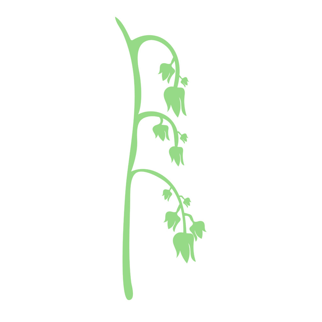
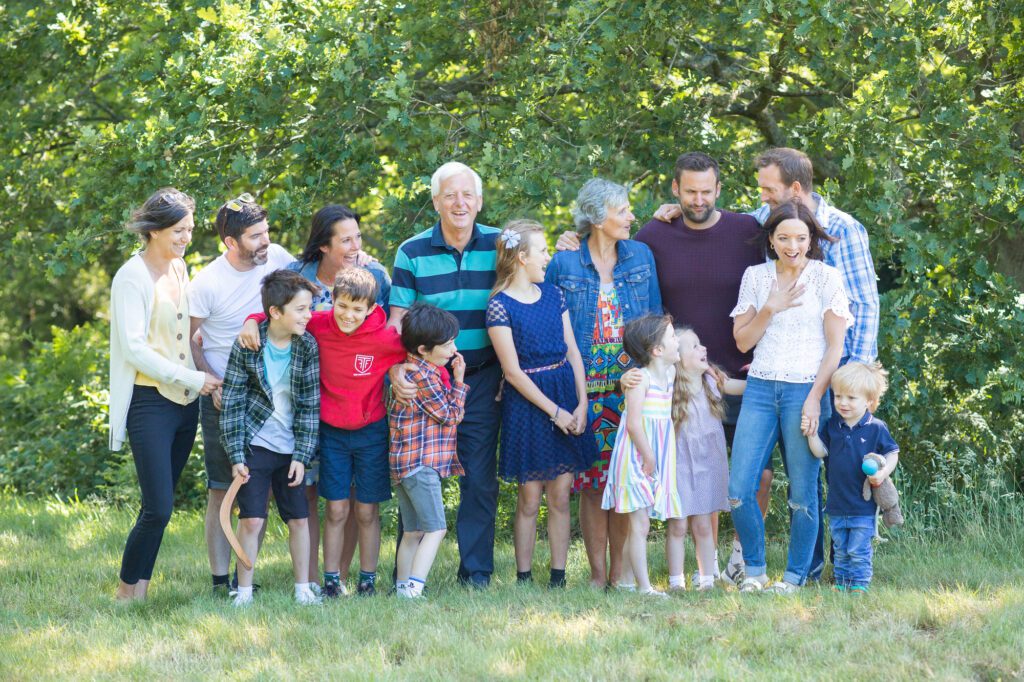
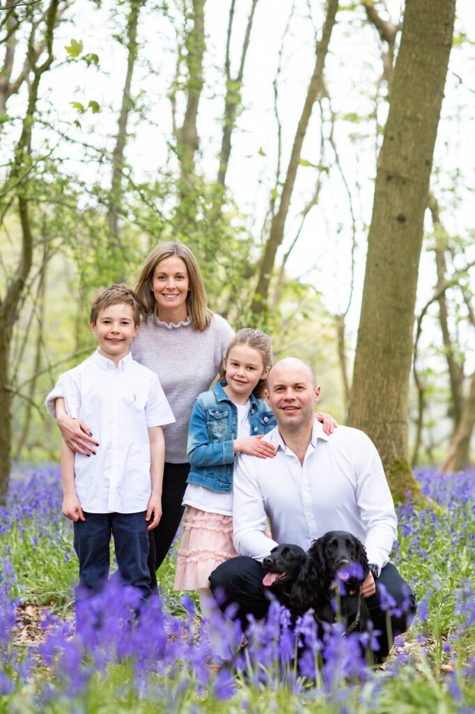
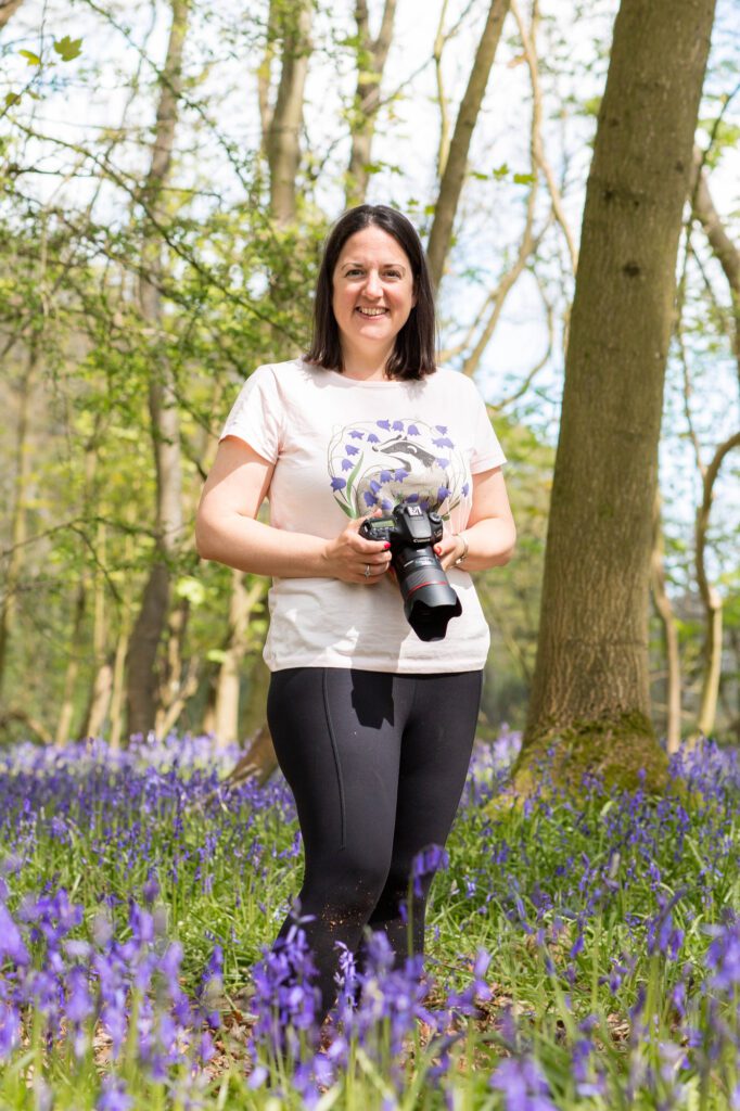
I have other motifs from nature, that are slightly seasonal and also have meaning for me. The bluebell (of course, if you know me!) is a key flower for me when I do spring photo shoots. Bluebell minis are where I started my family photography and they’re so special because they don’t sprout up everywhere and they bloom for such a short period. They mark the start of my family photography for the year as I don’t do much of this over the winter.
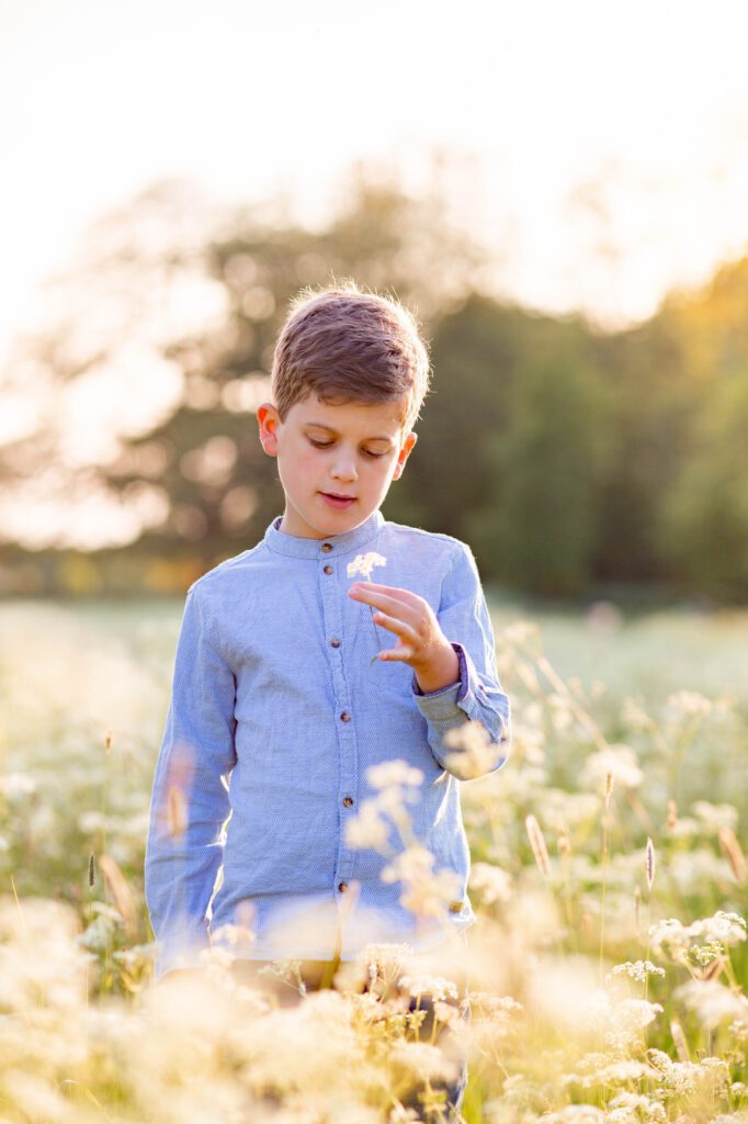
The cow parsley makes me think of the start of summer and reminds me of lockdown along the canal behind our house where we would walk most days. I started my business properly just before lockdown so it had a big impact on me (as it did everyone I think). I started trail running and exploring my local countryside more (which is often how I found locations for my family shoots). I would take the kids for walks and being in nature became my escape and joy each day (and still is).
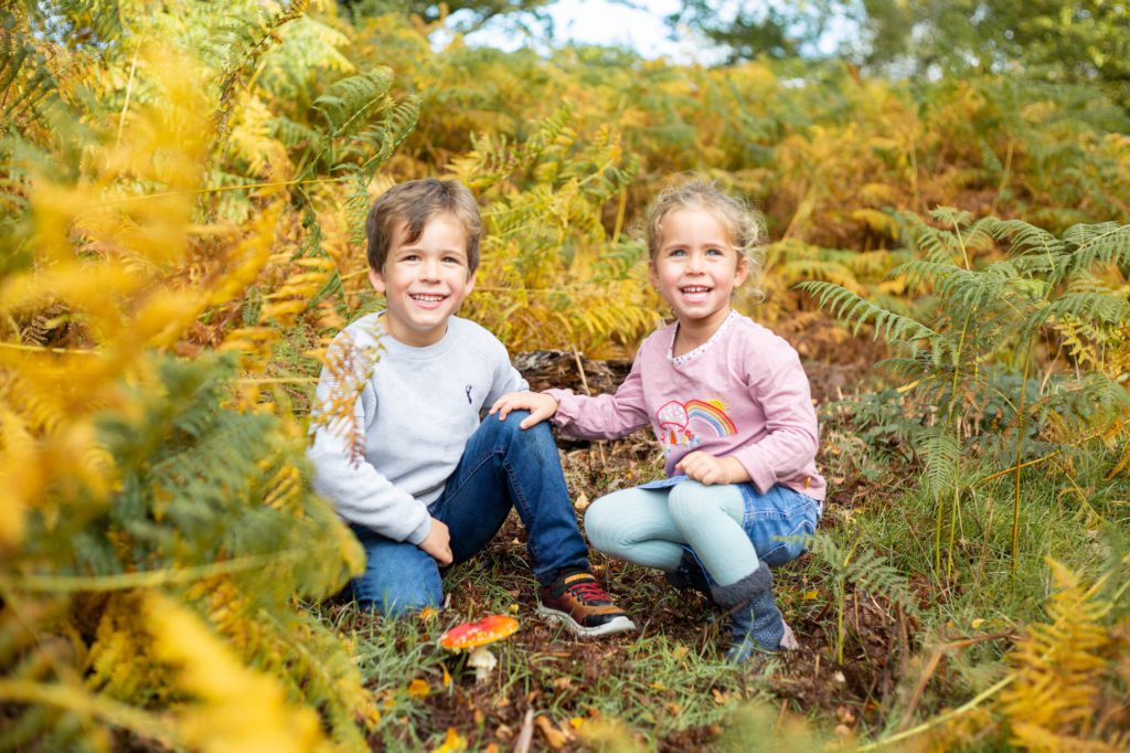
Finally the fern, which we have a lot of in woodland areas. It reminds me of my autumn mini sessions in Ashridge and using the leaves as tickle sticks for the kids! They’re are great for hiding in through summer and autumn as they are the perfect height for children.
Sam also created a business card for me that I love, and it was great to see the elements of my brand come together. Although I’m a creative person, it’s not a patch on what Sam has created for me with her years of experience in graphic design. It definitely has the wow factor for me! She has managed to encapsulate my business identity in a beautiful way. If you’d like to check out Sam’s services, you can do so here and I can’t recommend her enough https://www.gabmarketing.co.uk/
0 Comments